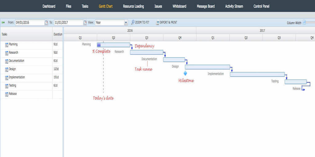
 Most people probably think that the Gantt Chart was developed by Microsoft. In fact, the Gantt Chart was released by Henry Gantt in the early 1910s and remains relatively unchanged. How is it that a tool that is over 100 years old is still in use when so many other technologies have come and gone during this era? Simply stated, the Gantt Chart remains the best way to visualize and track a project plan. A Gantt Chart is probably the best tool to depict:
The start and end date of each task
Relationships and dependencies between tasks
The relationship between planned versus actual time
The critical path for a project
The entire project plan at a glance
Every few years, a software company releases a new tool that is supposed to make the Gantt Chart redundant. In fact, it has become a cottage industry to predict the demise or irrelevancy of the Gantt Chart.
Below, we have listed 3 good reasons why the Gantt Chart is as useful today as it was in 1910. More to the point, I’m also going to show the enhancements to Gantt we are seeing in online project management software (sorry Microsoft).
Gantt Chart for Project Planning and tracking
Project Management newbies are mystified or even intimidated by the Gantt Chart.
Their assumption (or fear) is that only an experienced Project Manager with formal training can create a large number of multi-colored, overlapping and interconnected bars and lines.
To create a Gantt Chart, all you need is some paper, a pen, and a steady hand.
Sure, the software helps (and we have even created some useful Gantt Chart templates to start you off), but at the end of the day, you only need to understand three basic things to make a Gantt Chart:
What are the basic Tasks in the Project Plan?
How long does each Task take?
Which Tasks need to be completed before another Task to begin?
If you are can answer these three questions, then it doesn’t matter if you are PMI certified or have the best online project management software in the market.
At the same time, the Gantt chart is probably the best tool for project tracking.
As project advances in time, its current status is updated in real time in the Gantt Chart.
With Gantt, You Can Map out Dependencies
A Project Plan is made up of a number of smaller tasks that are typically performed by a dedicated Project Team. If resources were infinite and time was endless, we could simply list the Tasks that need to be done and assign them to skilled experts.
In the real world, everyone on the project team wears multiple hats and in order to get someone assigned to a project, we need to beg, borrow or steal.
The Gantt Chart is a simple way to map out the dependencies between Tasks so that we have one view of which Tasks need to be completed in order for other Tasks to commence. For example, often a product team cannot finalize the design of a new feature until they get feedback on a product prototype from customers, or testing can’t start until a given part from the supplier arrives. The Gantt Chart will show that Customer Research as a dependency for Product Development and testing is dependent on part delivery by a third party.
Gantt Visualizes Project Progress for All Stakeholders
With Gantt Charts, all stakeholders who need to understand the project progress can see a clear snapshot at any given point. Your management cannot be expected to track Tasks individually and need to see the “big picture.” Team members need both the details of a project plan and also to see how their responsibilities impact the overall group. One of the most important thing that a Gantt chart does is to show when a Task is passed its deadline and how this affects the overall plan.
To make project planning easier, you can start with a project template.
So what is an Interactive Gantt Chart?
Thanks to online Project Management software such as Binfire, the Gantt chart can now be “Interactive.” An Interactive Gantt Chart enables the user to change the duration of a Task directly on the Gantt Chart, thereby updating the Task List & notifying all stakeholders automatically. All changes made in Gantt by one user, are seen by other users in real-time This simple but powerful feature upgrades the Gantt Chart from a reporting tool to an operational tool that keeps all team members up to date.
If you are interested in learning more about the Binfire Interactive Gantt Chart, this is a good video:
Are you interested in trying our Gantt software for free?
Each project in Binfire has its won Gantt. You can sign up and use the application for free for 30 days.
You can also schedule a demo. In 30 minutes we show how Binfire can help you and your team do more with less stress.
Are you using Interactive Gantt charts for Project Management?
We’d love to hear your comments on whether Gantt Charts are an essential part of your project planning and monitoring.


Pingback: Work breakdown structure- 2017 update - Collaboration Corner
Pingback: Work breakdown structure- 2017 update - Collaboration Corner
Pingback: Work breakdown structure- 2017 update - Collaboration Corner
Pingback: Work breakdown structure- 2017 update - Collaboration Corner
Pingback: Work breakdown structure- 2017 update - Collaboration Corner
Pingback: Online project management software can save your company
Pingback: Online project management software can save your company
Pingback: Online project management software can save your company
Pingback: Online project management software can save your company
Pingback: Online project management software can save your company
Pingback: Task Management Software - Collaboration Corner
Pingback: Task Management Software - Collaboration Corner
Pingback: Task Management Software - Collaboration Corner
Pingback: Task Management Software - Collaboration Corner
Pingback: Task Management Software - Collaboration Corner